
June 4, 2026

Signalling Work-in-Progress with Cycle Time Percentiles
Guest Author - Benjamin Richards | Workflow Optimization Superhero & ProKanban.org Community Contributor
We often talk about wanting to be more predictable, to improve flow, and to deliver with confidence. The reality is that predictability doesn’t come from gut feel; it comes from the system. And if the system is purposeful, it will surface signals that guide the team’s attention at the right time.
This article sets out a simple way to enable those signals: using cycle time percentiles as visual cues on your Kanban board. The intent is to make invisible delays visible, so the team can act early and together. Think of it as a digital Andon cord, a prompt that something needs attention, not blame, but support.
Realised Outcomes
With a simple configuration, by setting colour thresholds (green, amber, red) aligned to your cycle time percentiles, every piece of work becomes part of a purposeful system that:
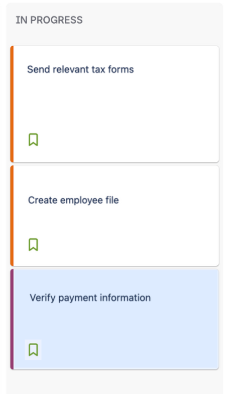
- Signals flow health – Cards change colour as they age, showing where work sits relative to history.
- Invites timely intervention – Amber and red items act as “Andon cord” moments: an opportunity to pause, ask, and respond as a team.
- Builds predictability – Reinforces cycle time data as more than a metric — it becomes part of daily behaviour.
- Enhances quality and sizing – The team sees when work is “too big” or getting stuck, enabling earlier conversations about breaking it down or removing blockers.
Percentiles & Thresholds
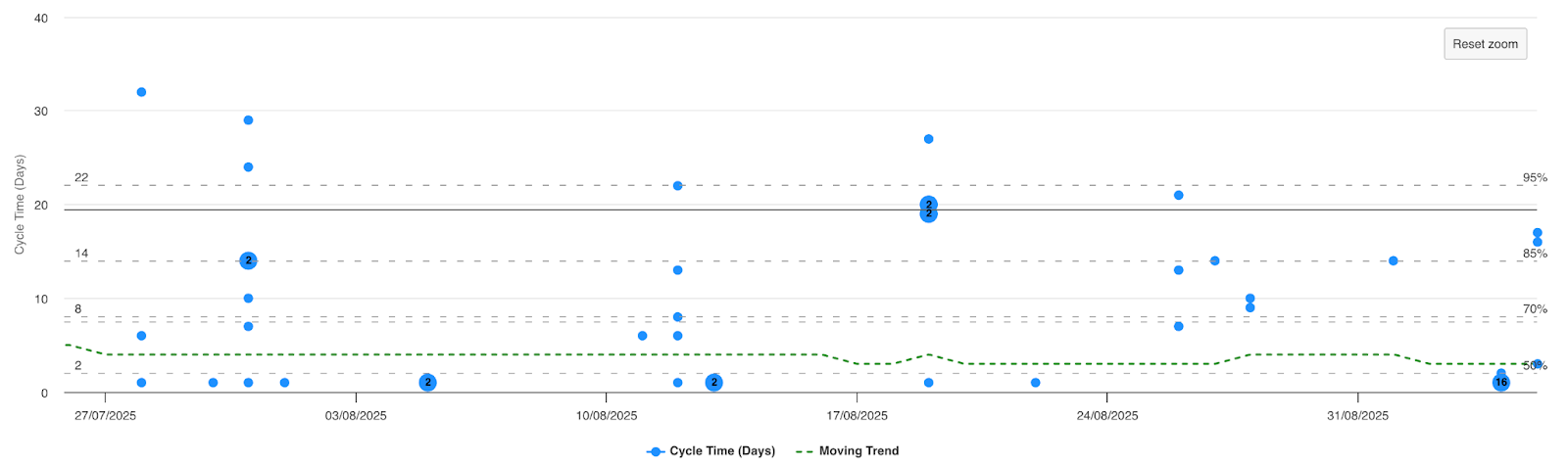
The choice of 50th, 70th, and 85th percentiles is deliberate.
- 50th percentile (green): The median tells you how long work typically takes. If your work item is still green, it’s progressing in line with the system’s usual pace.
- 70th percentile (amber): At this point, amber is your early warning — it signals and invites investigation.
- 85th percentile (red): Crossing this threshold indicates unusual delay. These are true exceptions that call for immediate team focus.
This mirrors Lean’s philosophy of visual controls — signals that move from normal operation → warning → intervention required.
Could you use different thresholds? Yes. Some teams may prefer 50th/80th/95th, or a tighter set if they want more sensitivity. The important thing is consistency: thresholds should reflect your data and be meaningful enough to drive action.
For further grounding, see ProKanban.org’s spotlight on cycle time, which explains why percentiles (not averages) are the most reliable way to represent how work flows.
How to Find Your Percentiles
To put this into practice, you first need to know your own cycle time percentiles.
- Agree workflow boundaries – e.g. “In Progress” → “Done.”
- Pull historical data – From Jira’s Control Chart, ActionableAgile, or an export.
- Calculate percentiles – Determine the 50th, 70th, and 85th (or other chosen thresholds).
Good references:
- ProKanban – Flow Metric Spotlight: Cycle Time
- ProKanban – Why Measuring Individual Cycle Time is Killing Your Flow
How to Set It Up in Jira
Once you know your percentiles, translate them into signals on your board. To do this, we will use three JQL queries to enable the view.
Depending on your JIRA instance and configuration, you may have to check and align accordingly.
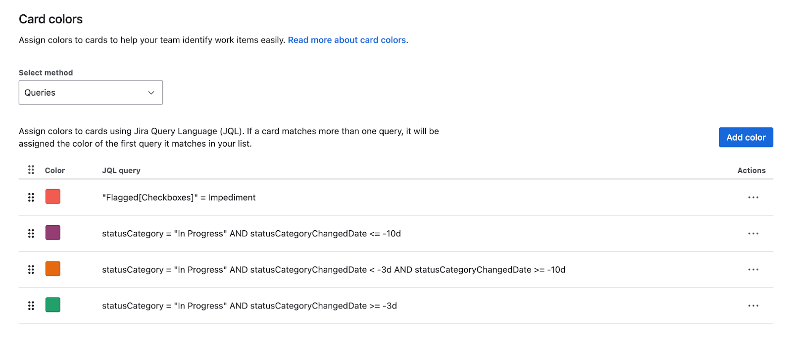
JQL Explanation
- statusCategory = "In Progress" → only include items currently being worked on.
- statusCategoryChangedDate >= -3d → find issues that entered the In Progress category within the last 3 days.
JQL queries for thresholds
Green (≤ P50)
“statusCategory = "In Progress" AND statusCategoryChangedDate >= -3d”
Amber (> P50 and ≤ P70)
“statusCategory = "In Progress" AND statusCategoryChangedDate < -3d AND statusCategoryChangedDate >= -9d”
Red (> 70 and < P85)
“statusCategory = "In Progress" AND statusCategoryChangedDate < -10d”
*Note, as the JQL query is within a “Project” it is already contained and we do not need to include “Project = x” as an example.
Where to configure (cards)
- Locate your project
- Click “Board Settings”

- Click “Layout”
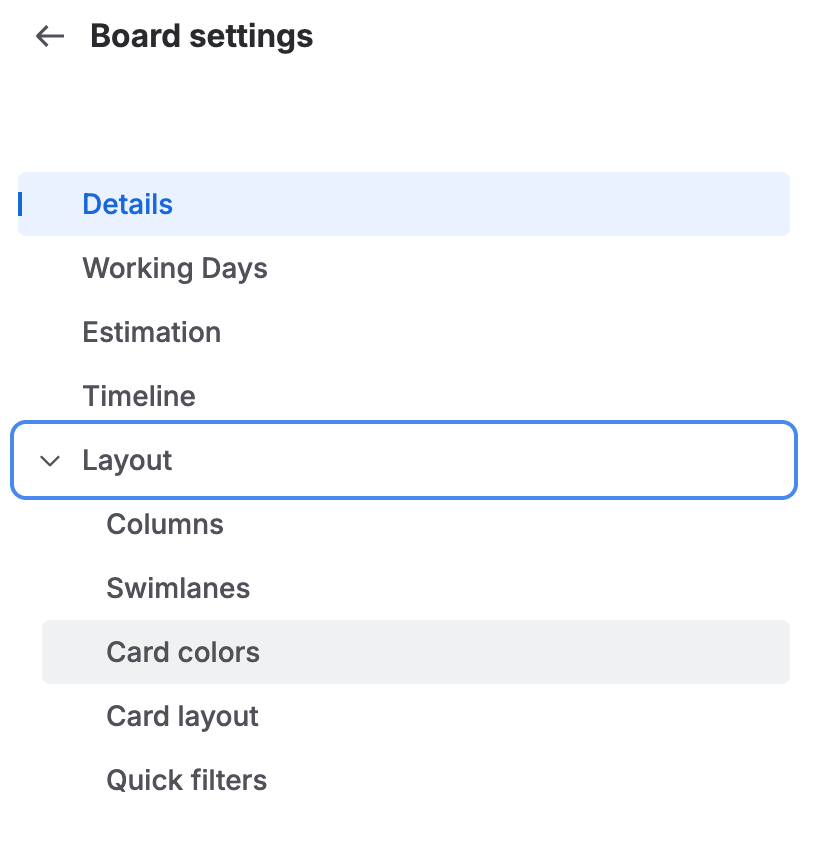
- Click “Card Colours”
- Change “Select Method” to “Queries”
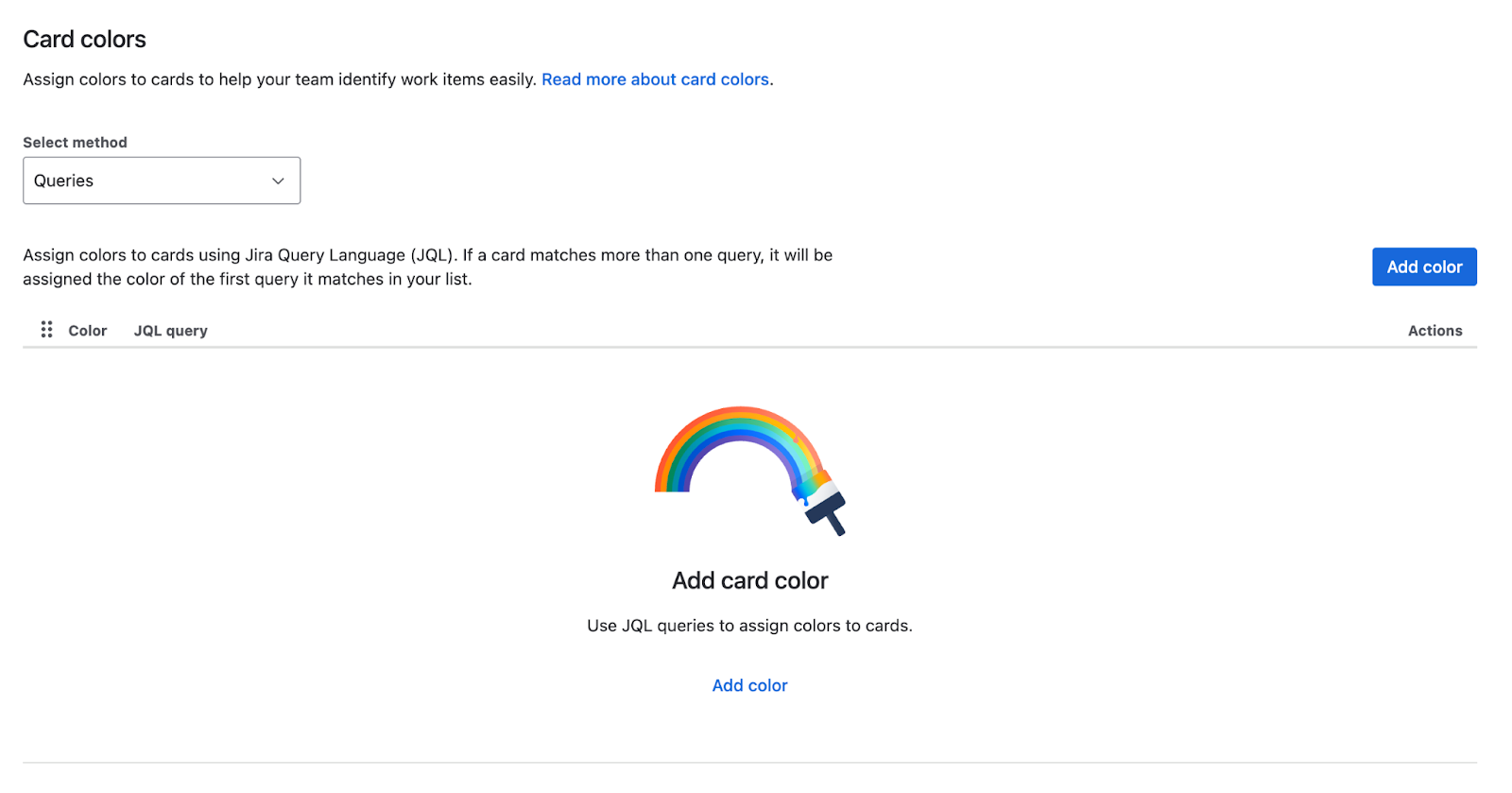

- Apply threshold and select respective card colours
Now your board is alive with signals.
Beyond the Signals: Reducing Variability
The real power isn’t just in spotting red cards. It’s in the reflection that follows.
Over time, if you see fewer items turning amber or red, it means you’re reducing variability. And with reduced variability comes
- Predictability – Future work is easier to forecast.
- Confidence – Teams can commit with more certainty.
- Credibility – Stakeholders experience consistency, not surprise.
The system is purposeful — it’s not just about moving cards across a board, but about building trust in how the team delivers.
This approach is universal.
- At the issue level – Helps keep day-to-day flow healthy.
- At the epic level – Makes larger pieces of work equally transparent, surfacing when initiatives are running beyond expected timeframes.
The principle remains the same: compare work-in-progress against what your system historically tells you is “normal.”
Closing
Cycle time percentiles tell the story of your past. Adding signals to your Jira board brings that story into the present.
By designing the board to surface green, amber, and red thresholds, you enable the system to act with intent. Each signal becomes an Andon cord moment: a chance to pause, problem-solve, and improve.
And as you reduce variability, you’re not just making the system predictable — you’re building confidence within the team and credibility beyond it.
