
June 4, 2026

Visualizing Flow Metrics - Where to Begin

Cluttered dashboards overwhelm. A few key signals guide you where you need to go.
Let’s get one thing straight: starting with all the flow metrics at once is a great way to end up using none of them.
Somewhere along the way, we decided that “visualising flow” means creating dashboards that look like the inside of a 747 cockpit - scatterplots, run charts, cumulative flow diagrams, SLE overlays, and percentiles everywhere. And sure, it looks impressive (and who doesn't love a bit of visual candy). But if you can’t point to a chart and tell me what decision it’s helping you make today, then you are decorating, not creating insight.
Flow metrics aren’t about impressing your stakeholders with graphs. They’re about putting the right signals in front of the right people at the right time so you can spot trouble early, steer faster, and improve deliberately. That’s exactly what the third Kanban practice calls for: using flow metrics as feedback loops for continuous improvement. The guide makes it clear that these aren’t optional extras; they’re how you know if your system is actually getting better.
Here’s the real headline:
You don’t need all the charts to start seeing flow. You need the right few, and the conversations that go with them.
In this post, I’ll share three hard-won lessons from teams who’ve made flow metrics part of their everyday working habits (and from a few who drowned in charts they never looked at again). You’ll get the same kind of field-tested, practical advice you expect from me: what to start with, what to skip, and how to build a flow metrics practice that sticks.
Because here’s the truth: flow metrics only matter if they drive action. The teams that succeed don’t treat them as dashboards to admire, but as signals that guide daily choices, weekly adjustments, and long-term improvements. That’s the difference between metrics that live and breathe in your workflow and metrics that die on the wall.
And that’s why the title: it’s not about “using” flow metrics, it’s about making them a habit, something so embedded in how you work that improvement becomes second nature.
The four metrics that matter (and the ones you can ignore… for now)
Before we charge off and try to measure everything, let’s start with (a little-known) truth: most teams don’t need more than four flow metrics to get real value. That’s it. Four.
The temptation is to throw in everything: flow efficiency, 'Time on State" breakdowns, blocked-day ratios, maybe even resurrecting velocity in disguise. Don’t. That’s how you end up staring at a wall of charts and realising you haven’t made a single better decision because of them.
The Kanban Guide makes it clear: these four aren’t optional. They’re mandatory.
- Work In Progress (WIP): The number of work items started but not finished.
- Throughput: The number of work items finished per unit of time. Note: The measurement of throughput is the exact count of work items.
- Work Item Age: The elapsed time between when a work item started and the current date.
- Cycle Time: The elapsed time between when a work item started and when a work item finished.
That’s the baseline. Clear, precise, and consistent.
But definitions alone don’t change behaviour, so here’s what these metrics look like when you put them to work:
- Throughput: a count of completions. It’s your track record of how much you actually finished in a given period, not what you thought you would.
- Cycle Time: your predictability check. It tells you how long items really take to get from start to finish, including the awkward outliers you wish you could ignore.
- WIP: your system’s workload in motion. When it climbs, predictability and focus usually crash.
- Work Item Age: your early warning system. The longer something has been sitting in progress, the louder the alarm that it might not finish predictably.
Start here. Nail these four. Once they’re part of your everyday vocabulary, you’ll have more than compliance with the Guide; you’ll have the signals you need to steer your system.
And a quick word on SLEs (Service Level Expectations).
The Kanban Guide defines an SLE as a forecast of how long it should take a work item to flow from started to finished, expressed as both an elapsed time and a probability. For example: “85% of our items finish in 12 days or less.”
That probability piece is key: it’s not a target to hit, and it’s not a stakeholder promise. It’s a data-driven expectation, rooted in your historical cycle times. If you don’t have that data yet, start with a best guess - the Guide explicitly says that’s fine, and then replace it with real numbers once you’ve built up some history.
Once calculated, the SLE becomes your reference point. It’s what you overlay on your Cycle Time scatterplot to see how predictably you’re finishing work, and it’s what gives your Ageing WIP chart its teeth by showing which items are drifting outside the expected delivery window.
Hard-won lesson #1: Resist the urge to over-instrument
The fastest way to kill interest in flow metrics? Show up one morning with a brand-new dashboard crammed full of every chart you could get your hands on.
The point of visualising flow metrics is not to see everything, it’s to see enough to act. Early on, that means starting small. One in-flight signal and one past-performance truth is all you need to begin.
- Past-performance truth: cycle time scatterplot with percentile/SLE lines. This shows every item you’ve finished, how long each took, and how much those times vary. Instead of hiding the slow items inside a single “average cycle time,” you see the full spread - the quick wins, the typical work, and the painful outliers, so you can spot patterns and plan more realistically. Think of it like the difference between reading a coffee shop sign that says “average wait time: 4 minutes” versus actually looking at the queue. Half the customers got their coffee in two minutes, plenty in four, and a few poor souls stood there for ten. The average hides the truth.
And here’s the key: cycle time isn’t a number, it’s a shape. The scatterplot shows you the distribution - the range, the clusters, and the tail - that shape is where predictability lives (or dies).
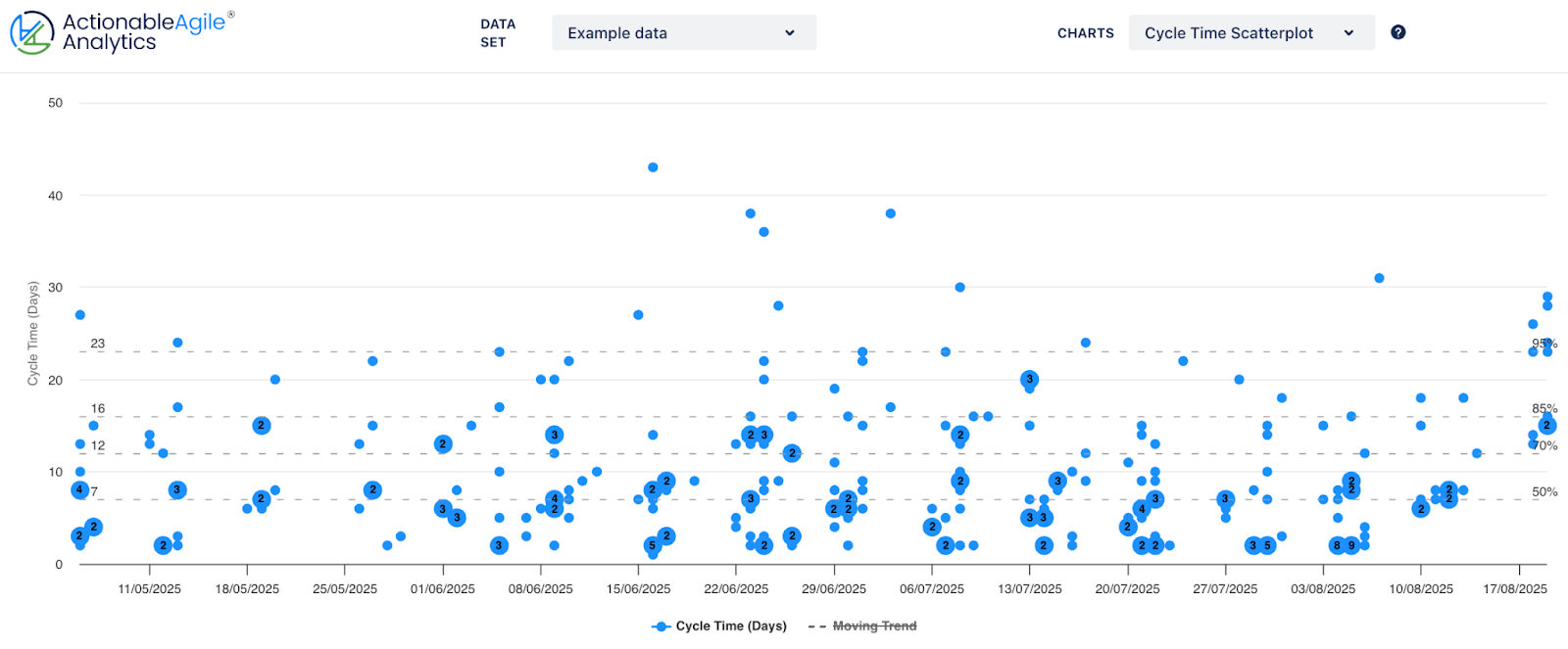
"A Cycle Time Scatterplot with percentile lines: each dot is a completed item, and the horizontal lines show where 50%, 70%, 85%, and 95% of work usually lands. It’s your reality check on predictability; you can instantly see stability, exceptions, and whether your Service Level Expectation (SLE) still holds."
- In-flight signal: work item age chart, keyed to that SLE from the scatterplot. On its own, a WIA chart is just a list of birthdays. When you colour it by “inside SLE,” “approaching SLE,” and “beyond SLE,” it becomes a smoke alarm: you can see which items are quietly getting stuck before they blow your delivery dates.
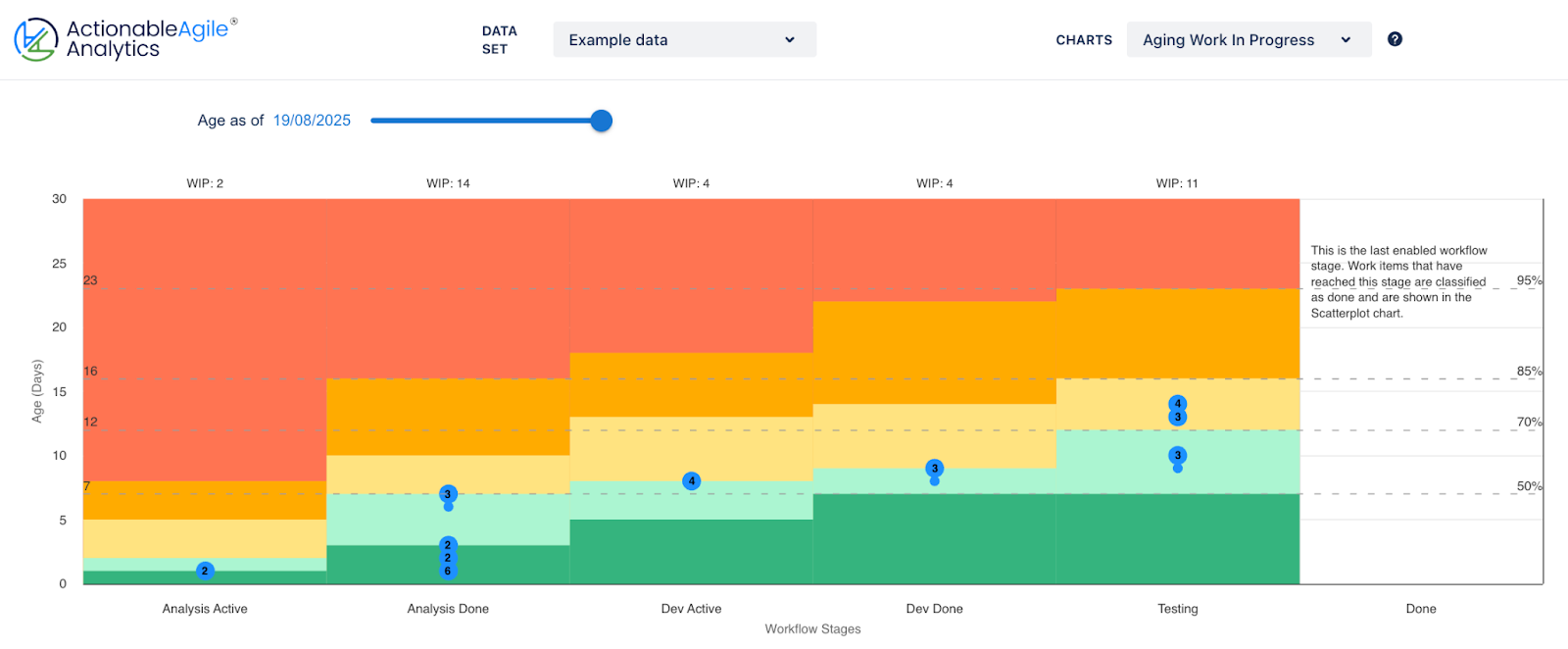
"An Ageing WIP chart: each dot is a work item in progress, coloured by how long it’s been open against your Service Level Expectation (SLE). This is your daily radar; start with the items drifting into the orange and red zones."
The Dashboard Diet
I once inherited a team dashboard with 19 "widgets". It looked like the cockpit of a 747, and no one could tell me which one they used to make a decision.
Here’s a real example of the kind of thing I mean (yes, I really found this in the wild). At first glance, it looks data-rich. In practice? No one could tell me which (of any) of these lines mattered for today’s standup. And that’s before we get into all the other problems with this one.
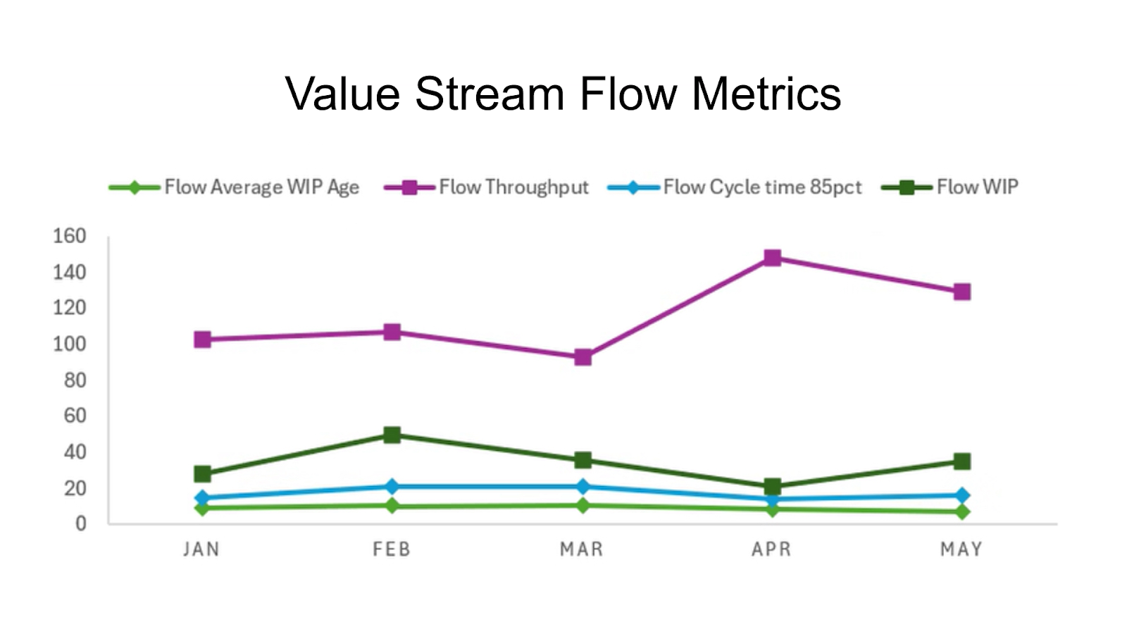
"One chart to rule them all? Not really. Mashing all four flow metrics into one view looks efficient, but hides the very patterns we’re trying to see. This is exactly what not to do."
Within two weeks, the team and I had cut it to four, and suddenly the data was telling us something useful about our workflow, and about what to act on next. You don’t need more charts; you need the right charts.
Practical start
- Daily: Open the Ageing WIP chart, and starting with the oldest item to the right, ask, “What’s stopping this from moving today?”
- Weekly: Review the Cycle Time scatterplot with percentile lines. Ask, “Are we predictably inside our SLE? What’s behind the outliers?”
When those conversations happen without prompting, then you’re ready to add more.
Hard-won lesson #2: How to stop metrics becoming wallpaper
A chart on its own is just ink on a page or pixels on a screen. Without context, it’s novelty; something you nod at in a review and forget five minutes later.
The fix? Pair every metric with two things:
- A policy: what it means for how you work.
- A trigger question: what should you do when you see a specific pattern?
That combination turns a passive chart into an actionable signal.
Take Work Item Age:
- Without a policy, it’s just a list of birthdays.
- With a policy (“Swarm on any item past 70% of SLE”), it becomes a daily decision point.
Or Cycle Time scatterplot:
- Without a policy, it’s dots on a page.
- With a policy (“Maintain predictability inside our 85th percentile”), it becomes a reliability check.
Example: Metric + Policy + Trigger Question

The power isn’t in the chart. It’s in what you do when it tells you something uncomfortable.
Hard-won lesson #3: Start with the decision
If you can’t name the decision a chart helps you make, it’s not a metric, it’s décor.
Too many teams start with “What can we measure?” instead of “What do we need to decide?” That’s backwards. The scatterplot, the run chart, the WIP trend - none of them matter until they’re helping you answer a decision that’s real in your context.
So start there: identify the decision you need to make most often, then choose the metric and visualisation that gives you the clearest, fastest signal.
If metrics only matter when they drive decisions, the next question is obvious: how do you connect the dots? Let's take a look at a quick map from decision → metric → visualisation.
From decision to visualisation: Your quick start guide
When you’re looking at flow metrics, don’t start with the charts; begin with the decision you need to make. Here’s how you can match the right chart to the decision in front of you.
Decisions You Need to Make
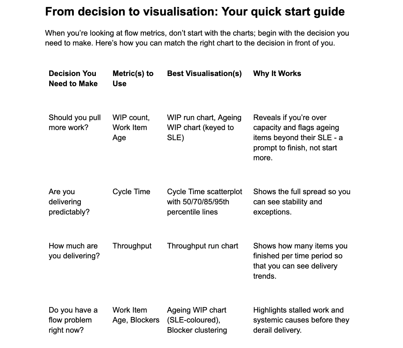
Start with the decision. Then the metric. Then the visualisation. That order is non-negotiable if you want flow metrics to drive action instead of gathering dust.
Common pitfalls and how to avoid them
Flow metrics are simple in theory, but the way teams misuse them can strip out all their value. Here are the traps I see most often, and how to sidestep them.
1. Drowning in Averages
- The pitfall: Teams collapse all their data into a single “average cycle time” or “average throughput.” It feels clean, but it hides reality, and it makes outliers invisible until they bite.
- Avoid it: Always look at the spread. Percentiles, scatterplots, and run charts tell you the real story. The average is a smoke screen.
2. Aggregating Across Teams
- The pitfall: Rolling up data from five different teams into one chart. It smooths the numbers but destroys the signal. One team’s predictability hides another team’s chaos.
- Avoid it: Keep flow metrics at the team (or stream) level. If you need a higher-level view, show the range (best case, worst case, median) rather than a single “portfolio number.”
3. Metrics as Status Wallpaper
- The pitfall: Dashboards become a backdrop. They’re looked at in reviews, nodded at, then ignored. No policies, no questions, no action.
- Avoid it: Tie every metric to a policy and a trigger question (Lesson #2). If you can’t name the decision it helps you make, drop it.
4. Using Metrics to Compare Teams
- The pitfall: Leadership stacks throughput charts side by side to declare winners and losers. Cue the gaming, hiding, and excuses.
- Avoid it: Metrics aren’t performance scores. They’re feedback loops. Use them to improve predictability, not to judge.
5. Only Looking Backwards
- The pitfall: Treating flow metrics like end-of-sprint burndowns - nice post-mortems, but useless for steering.
- Avoid it: Balance hindsight with foresight by pairing cycle time scatterplots (past performance) with Ageing WIP charts (in-flight signals). Look back and look ahead.
6. Treating Metrics as Optional Extras
- The pitfall: Teams bolt flow metrics on top of the board as “reporting,” not as part of daily work.
- Avoid it: Put them front and centre in standups, reviews, and retros. If they’re not shaping conversations, they’re not doing their job.
The real test: If your metrics disappeared tomorrow, would the way your team works actually change? If the answer is no, they were never more than decoration.
Building the habit - making flow metrics part of the work
Dashboards don’t change behaviour. Habits do.
So if your flow metrics live in a dusty Confluence page or are buried two clicks deep in a BI tool, they’ll never shape how the team works. Metrics only matter when they’re visible, immediate, and connected to the conversations you’re already having.
Here’s how teams build the habit:
1. Make them visible
- Put Ageing WIP or Blocker views on the wall (or the digital equivalent). These are your daily signals, and if you can’t see them, you can’t act on them.
- Publish your team’s SLE where everyone can see it, right on the board, dashboard, or wall. It’s not just a number; it’s a shared agreement about what predictable delivery looks like.
- Don’t make people dig through three tools to find them. Out of sight is out of mind. If the signals aren’t easy to access, they won’t be used.
- It matters less which tool you use - Excel, Jira, Miro, Azure DevOps, ActionableAgile - than whether the chart sparks a conversation. Start with whatever you can make visible fastest. The right tool is the one your team looks at.
2. Anchor them in daily conversations
- Start standups with Ageing WIP instead of the dreaded “What did you do yesterday?” It instantly shifts focus from activity to flow. Everyone sees the same signal: which items are getting old, and what’s stopping them from moving.
- Use the WIP run chart to decide whether it’s safe to pull. Don’t rely on gut feel; let the data show if you’re already at or near capacity. If WIP is climbing, the answer is clear: finish before starting.
- Ask “What’s the data telling us?” before anyone volunteers an opinion. This single habit reframes the whole discussion. Instead of debating who’s right, the team inspects the signals together and decides what to do next.
3. Keep the review cadence simple
- Daily = flow signals: Use the Ageing WIP chart and blocker view to keep the system moving. These are smoke alarms; if they light up, you act now.
- Weekly = predictability checks: Look at the Cycle Time scatterplot (with SLE lines) and the WIP run chart. These tell you if your system is drifting - are you staying inside your SLE, or is WIP creeping up?
- Monthly = system health: Review Process Behaviour Charts (PBCs) for WIP, Cycle Time, and Throughput, and look at blocker clustering trends. This is where you see whether your system is truly stable, or if hidden issues are compounding. PBCs deserve a post of their own, but for now, think of them as guardrails that show if the system is drifting out of bounds.
4. Treat them as feedback, not surveillance
- The purpose isn’t to prove you’re “on track,” it’s to spot risks early and improve.
- If metrics feel like a report card, the habit won’t stick. If they feel like a radar, the team will use them, and not just to justify the past, but to steer the next move.
Bottom line: Metrics become powerful when they move from “the thing you look at in a retrospective” to “the thing that drives today’s conversation.” Build that habit, and you won’t need dashboards as decoration - you’ll have them as navigation.
Your Week 1 Flow Metrics Checklist
- Publish your SLE (using your Cycle Time scatterplot).
- Put your Ageing WIP chart (keyed to that SLE) somewhere the team sees it every day.
- Start standups by asking: “Which item is closest to breaking SLE?”
- End the week by reviewing the scatterplot: “Are we staying predictable? What caused outliers?”
That’s it. No fancy dashboards, no over-engineering. Four small steps that turn charts into habits.
Start small, and show your work
Visualising flow metrics isn’t about building the perfect dashboard. It’s about making the right signals visible, every day, in ways that change the conversation.
Publishing your SLE is a great example: it’s not decoration, it’s a line in the sand that says, “This is what predictability looks like for us.” Paired with Ageing WIP, Cycle Time scatterplots, and blocker policies, it turns charts into conversations that keep flow moving.
The expectation is higher now. It’s not enough to plot some dots and nod at them in a retrospective. You don’t get to outsource discipline to averages or bury predictability in a BI tool. You have to make it visible, tie it to policies, and act when the system speaks.
So here’s the challenge:
- If you’re starting out: Pick one in-flight (Ageing WIP) chart and one performance (Cycle Time scatterplot) chart. Use the scatterplot to define and publish your SLE, and then bring that SLE into your Ageing WIP chart so you can use it daily. That way, you’re grounding both the “today” and the “longer view” in the same data.
- If you’ve been doing this a while, raise the bar; add policies, questions, and habits that turn those signals into decisions.
- And if your dashboard is just decoration? Time for a reset.
Because the goal was never to admire the data.
The goal was always to improve flow.

