
June 4, 2026

How much data do I need to start forecasting?
As Daniel Vacanti puts it: “They are the five words that product development teams hate to hear most: ‘When will it be done?’” This blog is inspired by his work — and the thinking of others — on how to approach forecasting in a more practical, evidence-based way.
In ProKanban’s Applying Metrics for Predictability and Applying Flow Metrics for Scrum classes, we explore this question in depth. Students learn techniques to answer the hated question with confidence, using flow-based forecasting rather than estimation, endless planning and guesswork. This article is written mainly for my students: it’s a continuation of the conversation we begin in the classroom and a reference they can return to when putting these ideas into practice.
The question everyone asks
When people first consider forecasting, one question almost always comes up: “How much data do I need before I can begin?”
It’s an understandable concern. Forecasting often conjures images of massive spreadsheets, years of historical records and, frankly, a lot of faff before anything useful emerges. Many leaders assume that without a mountain of numbers, forecasts aren’t worth the paper (or pixels) they’re written on.
Here’s the good news: you don’t need to wait until you’ve stockpiled hundreds of observations. You can learn a surprising amount from far fewer data points than most people expect. The key is to know what’s “enough” to make a confident start — and to avoid delaying action while you chase diminishing returns.
Small data samples can give big insights
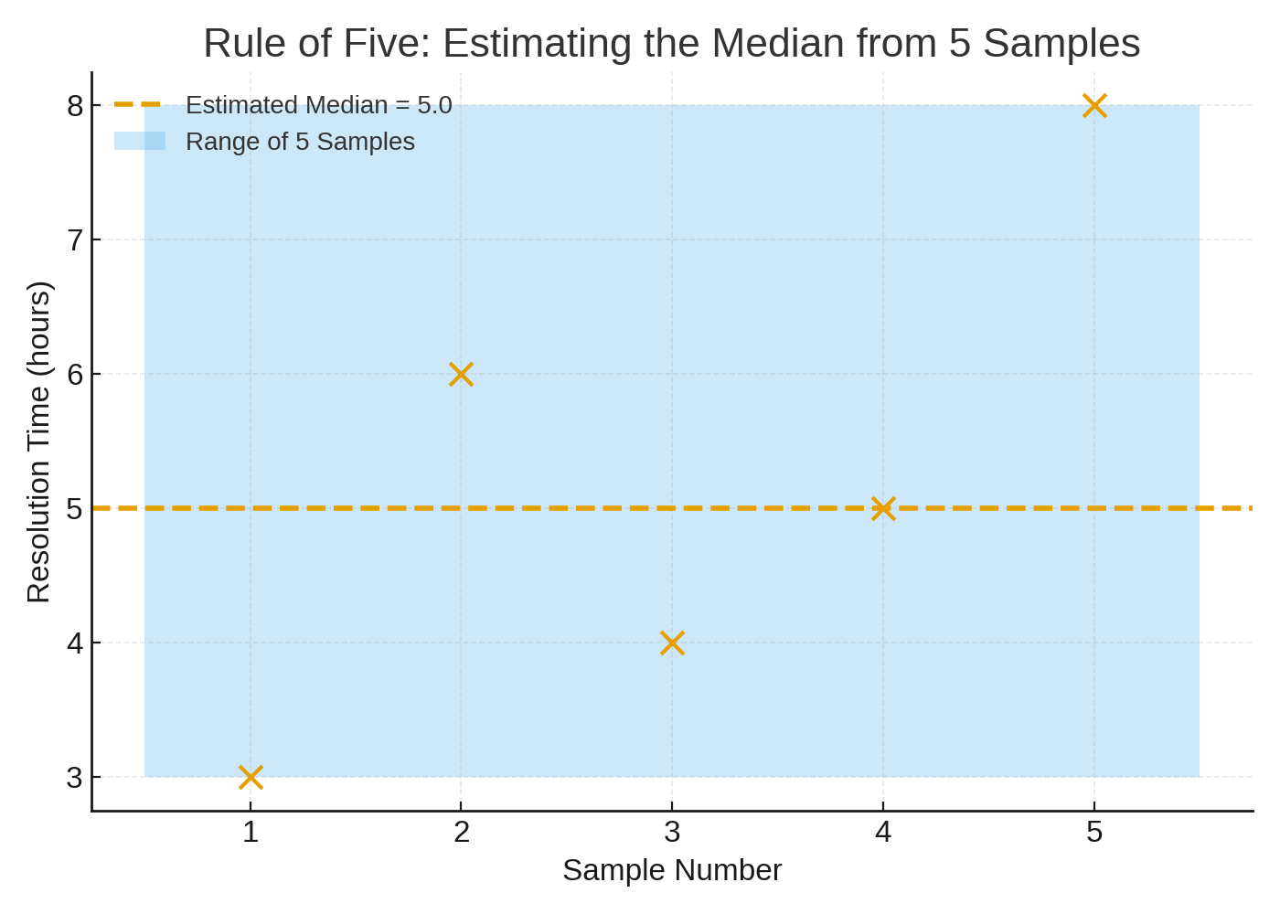
A helpful starting point is Douglas Hubbard’s “Rule of Five”, taken from his epic book How to Measure Anything: Finding the Value of Intangibles in Business. In simple terms, there is power in using small samples. In using an example of a population of employees, if you take a random sample of five items, there’s a 93.75% chance that the median of the whole population sits between the smallest and largest of those five. With only five observations you can already place the middle of your process with reasonable confidence.
Imagine a support desk measuring ticket resolution times. After just five completed tickets you won’t yet know everything about variability or extremes, but you’ll have a credible estimate of the 50th percentile — a surprisingly useful anchor for expectations and planning. Here’s what that looks like in practice.
Thinking in ranges
You can push the idea of “small data” further with a simple thought experiment: a fair six-sided die. Because each outcome is equally likely, the distribution of the results is uniform. After only 11 rolls, there’s already a strong chance the next roll will land between the minimum and maximum you’ve seen so far.
This is just a teaching device — or a conceptual model — because real processes are rarely so uniform. Even so, the message is clear: you don’t need a huge sample before useful boundaries start to appear. In fact, a small, up-to-date dataset often paints a more accurate picture of what’s happening right now than a large collection of stale, historical data.
To make this tangible, here’s a quick visual from a simulated set of eleven rolls. Notice how the min–max range firms up quickly. Again, this is a teaching device as we know the lower range of this data will be 1 and the upper range of this data will be 6 — and always a whole number in between. We know this before the simulation has even begun.
In product development, things are rarely that clear. Though the teaching point serves a purpose: a small sample gives us an astonishingly accurate distribution of the data.

So how many points should you gather before you draw proper limits around your process? A practical rule of thumb is to use a baseline of around 10 to 20 data points to calculate limits with confidence. Why that range? Because the real aim isn’t to hoard data; it’s to minimise two classic errors: mistaking noise for signal (seeing a pattern that isn’t there) and mistaking signal for noise (ignoring a real change). Ten to twenty recent observations usually strike the right balance — enough to separate pattern from randomness, but not so many that you anchor on outdated behaviour.
There are times when you can include more than 20 points, particularly if observations arrive quickly and you’re confident the process hasn’t changed materially. But beyond that, it’s sensible to treat your baseline as rolling. Newer points push out older ones so your forecast reflects current reality. This “rolling baseline” approach keeps your model alive to shifts in the system rather than embalmed in past performance.
Why more isn’t usually better
Why not simply collect more data forever? Three reasons. First, diminishing returns: the jump in understanding from 0 to 10 points is huge; from 100 to 110, usually tiny. Secondly, staleness: processes evolve — teams adopt new tools, policies change, markets move. Old data can become a poor guide to what comes next. Thirdly, practicality: the longer you wait to “have enough”, the longer you put off improving. Forecasting is a learning loop — and loops work best when they’re short.
A few exceptions and things to note
The key message so far is simple: you don’t need as much data as you think — so start with what you’ve got and get going!
That said, more data can be valuable. If someone gives me more data, I will always take it. My hope would be that it will give a richer picture of the process and make forecasts more robust; whether we’re looking at individual or multiple item forecasts. Just remember that at some point you’ll hit diminishing returns.
There are two important caveats here. First, recency matters more than volume. I’d take 15 fresh data points over 150 old ones in most contexts. Teams, portfolios, even whole organisations can change significantly over months, quarters and years. Old data may describe a world that no longer exists.
Second, make sure the data you use reflects the world you’re forecasting into. In the UK, for example, late December and early January are unusual times of the year: many people take time off for Christmas and New Year, which slows down work and skews flow metrics. Using that data to predict February performance would probably be misleading. Always choose samples from a period that looks like now. The simple rule might be: forecast the world you’re entering from where you’re coming from.
The Takeaways
There’s a softer, cultural benefit to starting small as well. Teams can be wary of data efforts if they sound like an enormous up-front investment. This is useful if you’re trying to convince your leadership to try flow metrics for the first time. Demonstrating value with just a handful of observations lowers the barrier to entry. People see early wins, develop trust in the measures and buy into the habit of continuously collecting and using data. Momentum beats perfection.
Here’s the crib sheet I often use as a concise set of takeaways to share:
- First: five data points are enough to estimate a median credibly, which is a surprisingly strong start for planning.
- Second: in simple cases, eleven observations already tell you a lot about range.
- Third: a rolling baseline of around 20 recent points is typically sufficient to establish useful limits and to separate signal from noise without drifting into historical trivia. If you need more precision later, you can always extend the window — but treat “more” as an option, not a default.
In summary
You probably need less data than you think to begin forecasting. Start with what you have, aim for a rolling window of 10–20 points, and keep the dataset fresh. Don’t discard old data: it can be useful to see trends, progression and other useful things. Just don’t be upset when you use it to forecast a world that no longer exists.
Then, use those early insights to set expectations, manage risk and spot change. Forecasting isn’t about waiting for perfect certainty; it’s about reducing uncertainty enough to act — and doing so sooner rather than later.